Think Pink!—A signal color and its effect on advertising
Now, during spring, the lush floral splendor with its bright colors catches our eye once again and provides variety and new joie de vivre after the winter gray. This is just the right time to deal with a color tone that stands for glaring effects like no other—PINK! The strong, rich pink, a variety of violet, is not only an eye-catcher in fashion and advertising, but it also emphasizes accents in royalty free stock photos.

Similar to the festive red, which we have already dealt with here, pink is distinguished above all by its signal effect. This is why we often come across this color in neon signs and advertisements. Unlike red and orange, pink is flashier because it is more unfamiliar to the eye; it is also a color that we rarely encounter in nature, and if we do, then it’s in the more delicate and fragrant flowers, if anything.
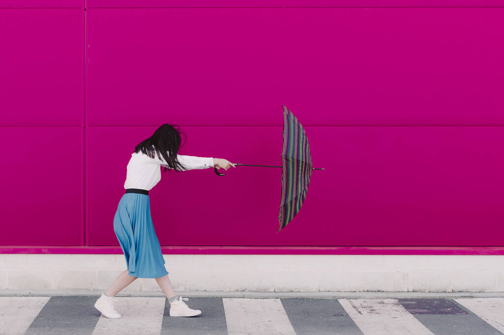
Looking for more of those lovely pink images? This way!
While pink has a long tradition, the stronger nuance pink, which contains more added blue, is a creation of modern times: It was the Italian fashion designer and artist Elsa Schiaparelli who took advantage of the striking effect of pink when she launched a perfume called “Shocking Pink” in 1931. A good idea, since pink stands for presence, being seen, dominance, and is sometimes enriched with a pinch of eroticism—and who doesn’t want to have these attributes?
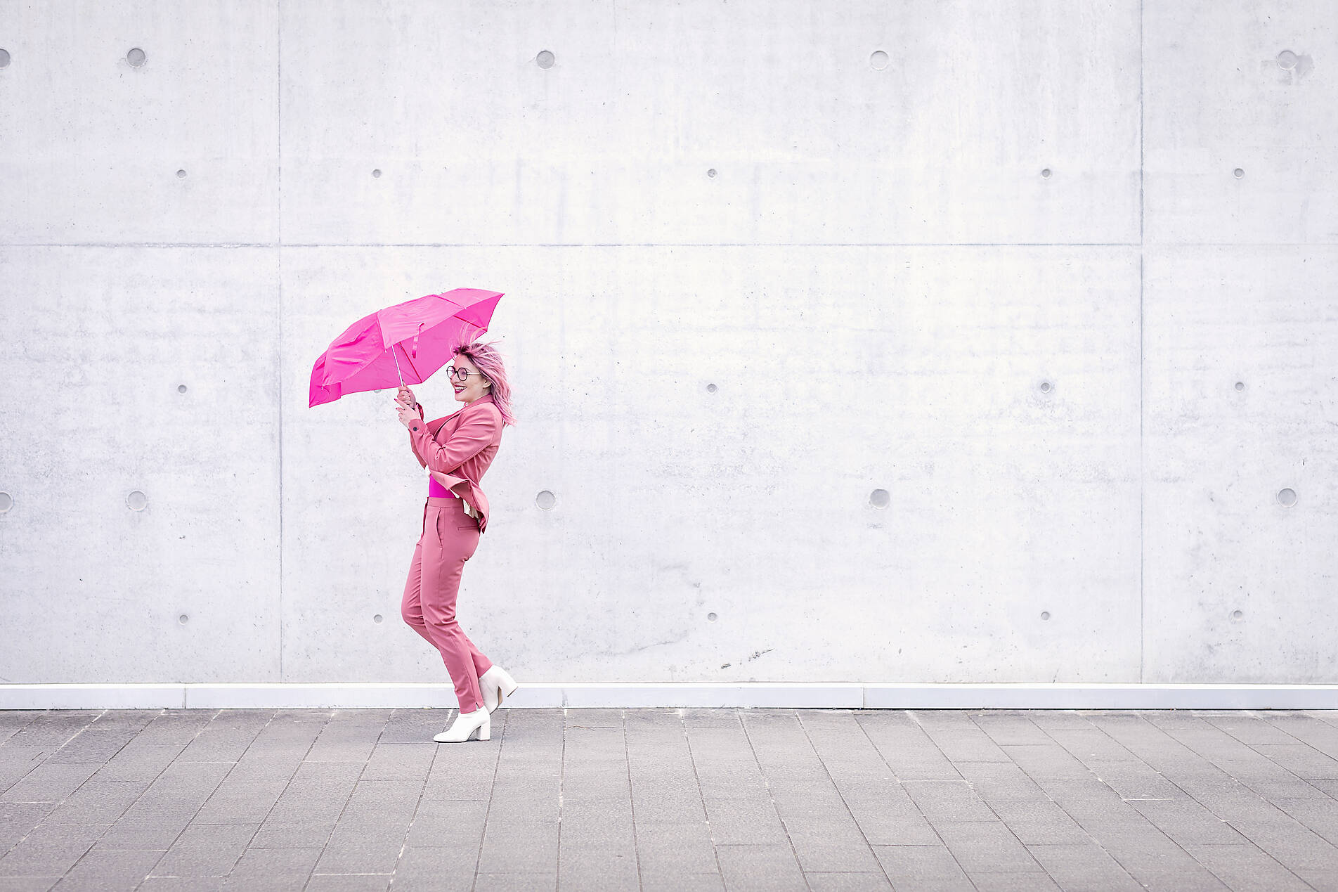

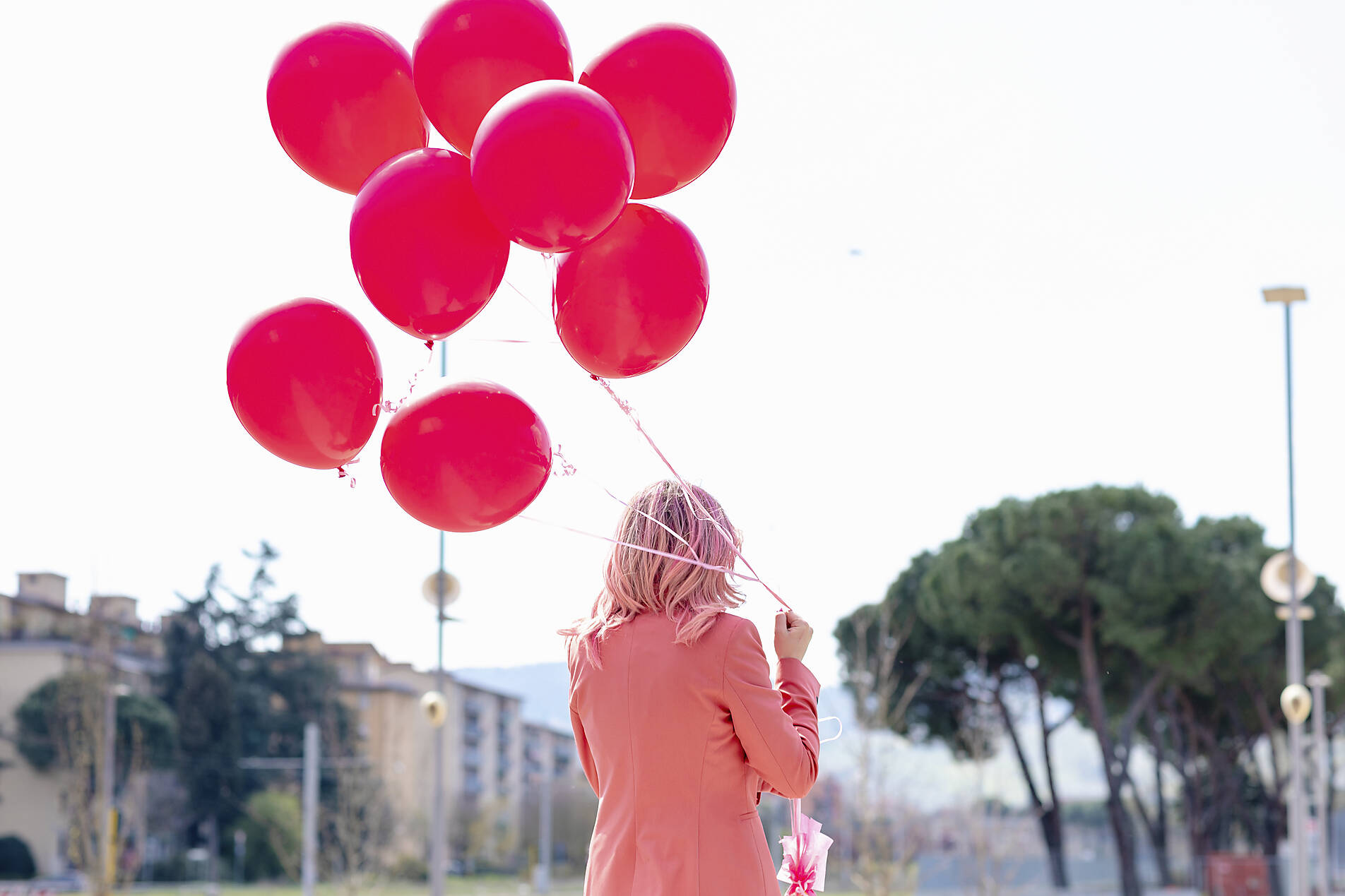
For a long time, pink was perceived in the western world primarily as a feminine alternative to the more masculine blue, but such color associations are changing: Even the masters of creation have long since recognized that pink accessories can have that certain extra something—for example, in the form of peppy socks that lend the smart businessman a touch of visual extravagance.
A color with a distinct style
Pink has a flashy, funky image, and there are many possibilities of gradation when it comes to making your appearance with this color note more interesting: From lacquered fingernails to red clothes to dyed hair, from eccentric to a little crazy to tarted up.

But too much can be too much: This also especially applies to a bright color like pink. One can also exaggerate the effort to attract all attention—and then it seems rather embarrassing. But not when one satirizes diva-like behavior by transferring it to four-legged friends who then serve (involuntarily) as amusement.
Pink stands for diversity
Political and social movements also use the high attention factor of the color pink to promote their causes—just think of the gay and lesbian movement. It’s no wonder the color pink is also said to have a strong effect on the human psyche: Pink reinforces positive feelings, calms aggression and violence, and makes things more balanced and calmer. The strong contrast effect of pink can be used in many ways to make a photo more interesting. In motifs from the working world, pink can brighten up a rather sober motif and thus make it appear friendlier: A few splashes of color make everyday office life even more entertaining. Pink stands for new vigor, youthfulness, and freshness and sets effective accents in photos that show something grown, tasteful, and solid—such as the pink color, for example, which gives an old board new luster.


The power of contrast
The contrast effect is strongest when gray or black and white tones are otherwise dominant: Then even the smallest message in pink becomes the all-dominant eye-catcher in a photo—all the more if not only the colors, but also the linear and curved lines provide additional tension, as here. Pink appears expressive and stimulating; it sets a colored exclamation mark and conveys the message: “Hey, life is colorful, not gray—Think Pink!” And besides, it does us all good to look at things through our pink glasses from time to time, right?