Communicate more purposefully with the right visual language
Images that remain in memory and evoke emotions in the viewer are characterized not only by technically good quality such as sharpness and high resolution, but also by a suitable picture for each theme. With this means of communication, the user of the image visually supports the thought that he wants to convey to the viewer. As diverse as the themes and messages illustrated with pictures are, the visual language must be variable in order to leave a coherent impression. It must be tailored to the wishes, needs, and expectations of the viewers and thus target a specific group.
In addition to the basic photographic design elements, contrasts, blurring, formats, details, props, and vividness, other elements also play a decisive role in the visual language. The theme of color can be perfectly illuminated with our monthly theme, Pink!, because here it becomes clear how diversely a color can be used as a design feature of imagery. If lines and surfaces are the nouns in the imagery, so to speak, then colors are the adjectives.
Each color is associated with certain characteristics, feelings, or processes, so for example blue with cold, red with hot, green with growth and blooming, etc. But it is not only the color alone and how it is interpreted by the viewer that matters, but also the context of the motif in which it is used. For pink, this in no way means that this color has to look cuddly sweet and babyish, but rather it has a much greater emotional range than one would initially suspect.
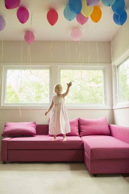
But naturally the traditional interpretation pattern of “pink = cute” still works.
But pink can also be used effectively in this context for cute pets.

Something similar, admittedly with a “plush” undertone, is conveyed by this picture, which radiates something lovely and old-fashioned and asks the viewer who might fancy hanging her jacket on this coat hanger.

Not far from this—but again, somewhat different—is rose’s sentimental connotation as expressed in this picture. The color design supports the heart-shaped alignment, which contrasts with the regular, symmetrical structure of the masonry behind it. Sober, professional post-it notes function as a means of expression for an intimate feeling of affection and attachment.

But pink is also quite different—for example, stylish and a bit rebellious like in this picture in which the young woman gives the viewer the finger.

But because pink in its somewhat more delicate nuance is the color of the soft clouds on which we float when we are in love, it can also be used to illustrate the intimate togetherness, indeed with a more or less distinct, erotic accent.

Not only love, but also all kinds of playfulness make life interesting and can give us a little break from the everyday. With motifs that illustrate the “playfulness” trend, pink then appears rather cheerful, calm, and, of course, somewhat frivolous—in contrast to the solid and reliable blue that banks and insurance companies often use to color their appearance.

Naturally, pink can also stand for “young,” like this girl’s dyed hair. The blue shapes and colors of the surrounding areas and the green motion blur of the landscape in front of the train window create tension and contrast.

In the context of nature motifs, pink can set interesting visual exclamation points. Here, too, we again encounter the interesting color triad of pink, blue, and red.

And if you like it a bit freakier, you might find yourself in this picture, another variant of pink’s versatile spectrum of meaning.

Finally, on the broad scale of meaning—at the opposite end of “childish-sweet-baby pink”—the effect of pink as a signal color stands for tempo, dynamics, and even aggression.

So you see: With the color pink combined with other means of design, each of these pictures conveys various emotions and arouses different emotions in the viewer. Among the pictures of Westend61, there are not only the best people and lifestyle photos, but also the whole spectrum of visual expression possibilities. Such subtle differences in meaning in the visual language help Westend61’s customers find the right optical tone for the respective application. Because only those who use the visual language that exactly matches their message will reach the heart and mind of their target group.